It's week two of my 24 hour weekly challenge. And this week I discovered that I actually knew nothing at all about Substance Designer than what I previously thought. Hooray. In fact, a lot of the time on this challenge was spent reading tutorials.
Ok, so I love nodes. I really enjoy plugging different combinations of nodes into each other and messing with values to get really interesting results. Whether this is plugging a turbulence map into an occlusion shader to generate edge wear or overlaying fractals to break up the roughness, the idea of shifting sliders and clicking boxes to generate materials interests me.
What I'm trying to say is that maths is sexy.
So when it came to learning such a dynamic piece of software like Substance Designer, it was like asking that really intelligent girl in your class out on a date. It was intimidating. So the approach I took to learning this software was exactly the same as if I was asking someone out on a date. I Googled how to do it and after 4 or 5 YouTube tutorials in, I was ready to start inverting some alphas and blending some normals.
Exactly the same.
I digress.
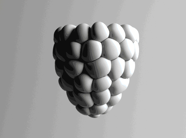
I picked an image from the internet (of all places, right?) and tried to match it as best as I could in Designer. This being the image you see at the top left of this post.

And where's a better place to start than from this grotesquely inefficient work flow of my final result?
I'm leaving this here, not for you to try and make sense of, but to show you an overview of where I spent my detail with this material.
As for anyone with eyes can clearly see, it's all in the normals. So that's where we'll start.
Normals

This isn't exactly the most complex node setup but I've broke it down into 4 sections because it's a lot easier for me to explain.
I learnt that starting off with the height/normals is usually the best way to go because you can get a lot of information from height data that helps with generating roughness and colour maps. So with the first thing first, I needed to create a sort of layered stone effect which I heard (copied from YouTube) works quite well for this sort of thing.
1. I started off by making a cloud node which is the sort of staple turbulence map you get if you want good luma variation. Then, totally contradicting what I just said, I plugged it into a levels and pumped the mid-tones out of it. This way when it's displayed in the normal channel the layers will be a lot sharper. After that I plugged it into a Slope Blur along with a duplicate clouds map which was offset. This give the basis for the layering and is the core of the normal map.
2. Now that I had the cornerstone (heh) of the map down I could then stretch it out and create two different variations of the map that would be scaled in two different directions. These were important for making the stones look like they were slotted into place at different angles.
3. This is where it starts to get a little complicated. So now that I had my two different variations I needed to plug them into something so that they would appear randomly on the hexagons. For this I created a simple hexagon shape (off screen) and threw that straight into a tile generator to get that nice tessellation. This is the node furthest to the top of this section. I could then use this base procedural to mask out the corners of the stone so that the normal map wouldn't show where the stones meet.
But we'll get to that.
I duplicated the tile generator and changed the Random Mask value to 0.5, so half of the tiles would be randomly masked out. This first half would be used to mask out one of the directional cloud procedurals that I made in section 2. From this I created an invert for the other half of the clouds to go in. Then I created two blends for the masked tiles and clouds to go in and now all I had to do was blend them together.
4. And I did. From this point on the normal was nearly completed but when comparing it to the reference there wasn't enough small detail, only the large slates. To get this small detail I created a Dirt map (also off screen) and plugged that into the foreground and background of a blend node. This way I was able to control the opacity, or strength if you will, of the map so it wouldn't completely dominate over the layered slate effect. I blended them together, plugged it into a normal converter and Bob's your uncle.

Don't worry guys, the worst is over and it's pretty much plain sailing from here.
That being said, lets get an easy one out the way shall we?

Height
The height node. Probably a node so complex that I could possibly jeopardise my career just be revealing its secrets.
That was a joke.
I obviously don't have a career.
But from that hex map (the black and white one I made to mask out the edges for the normal map) I changed the Luma variance to 0.5. This was just an easy displacement map that pushed a random number of the bricks out to a random height. Perfect.

Roughness

Roughness maps can usually be a bit tricky but (I cheated and picked reference that had none in) this one wasn't too bad. It being stone, the roughness value was fairly consistent all over but it did have a few specks of shine when caught in the right light. For this effect I used a cells node which creates sharp and flat specs which are almost perfect for the the type of values I needed. As you can't really control the scale in the base node, I plugged it into a Transform 2D and scaled it down so the specs were small enough. I blended it with the now-infamous hex mask, inverted it and it was ready to go! Unfortunately I haven't got a big image for this as the specs are so small I would have to zoom in and it would ruin the consistency of the image sizes I've been using. And we can't have that, can we?
Colour

Last and definitely the least. It's the Colour channel. Or Color channel, if you're joining me from across the pond. And if you are then I'm surprised that you know about this website. Well done. Have a prize.
Congratulations! The prize is a poorly written blog post about a process you probably already know about, and satirical, self-deprecating humour that is going way over your head.
Where was I? Ah yes.
Lets start with the colo(u)r picker in the gradient map node. This gradient picker saves so much time when it comes to finding the right colours. What I done, and what half of the Designer community seem to do, is import your reference into Designer and pick the colours from that. This way you can get the most accurate results in relation to whatever reference you're using. I fed a dirt map into the input channel of the Gradient map to vary the colours and give it a bit of a 'blotchy' look.
Side bar - This dirt map was also the same map I plugged into the small details part of the normal map. I kept the two the same so the variation of the colours would match the height. Moving on.
I also noticed that some of the stones were lighter and darker than others. So I used a random luma setting in the tiles (like with the height map) to blend with the base colour to give that exact effect.
Now, remember the stretched cloud maps I used to create the layered rock effect in the Normals section? Don't worry, I didn't expect you to either. Well I blended that with the colour map, after an invert, to change the lightness of the rock depending on it's height. I knocked the opacity down a bit so it wasn't so obtrusive but it give it that extra little bit of detail it needed.

Put them all together and what do you get?
(Anti-climactic results)


Reference Image used.