When it comes to finding inspiration online your options are almost limitless. Of all online resources, I find sites like CGSociety and ArtStation to be invaluable. I was looking for a good piece of concept art that was simple enough to take a few weekends to complete but not so detailed that it'd be a mammoth of a project. I came across Zach Sharts' concepts of various swords and after he obliged to let me use his art I opened ZBrush and started sculpting.
Cheers Zach.
The Sculpt
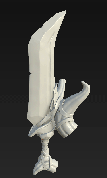
The initial design and shape was pretty straight forward. Everything was dynamesh'ed at the start to get a the basic shapes and then refined with more or less the move tool and hpolish. The style of the concept art was quite unique and when looking at reference for parts like the horns, I had to really exaggerate details like the crevices and dimples to give it that sort of cartoon feel. For the inside of horns at the bottom, I had to approach this a bit differently. With there being no more concept art to go by apart from the one image supplied, I had to use my imagination a little to create what was there. Reference of elephant and rhino horns was useful but they were hollow and I didn't really want to hollow it out to create unnecessary mesh for something that wasn't going to be seen. I imagined that whoever was wielding this weapon would have most likely ripped them from a creature's head, or to something of that effect. Keeping with the low detail theme I added a cluster of dimples that were slightly inset to make it look like where the flesh and bone marrow was connected to the rest of the body.
Topology and Prep
From ZBrush I just took this straight into Max and started retopologising it. There's probably hundreds of different ways you could do this with all the topology draw tools and the ZRemesher toolkit inside of ZBrush, but the one in Max is the one I feel most comfortable with. It's probably the least efficient but there's something therapeutic about pulling polys over a high res mesh. However dull I may make that sound. I'd prefer to do this over something like Topogun or ZRemesher as I feel that you can have more control and freedom when it comes to poly distribution. I eventually got it down to a suitable 3k tris.
After that I brought the high res and low res model into Substance Painter to get started with the painting. This is where I had my first problem. When baking the maps, especially the normals, the results it was giving me were not accurate around the bindings. Some of the mesh was overlapping and it struggled the calculate.
To solve this I split the sword from the bindings around the horns and baked them separately. I threw both maps into Photoshop and merged them. It worked like a dream. The minor drawback from doing that is that I didn't get accurate AO results from where the wraps come in contact with the horns. Luckily for me that since I was going for a very basic art style I could just paint it directly onto the map. Which I totally forgot to do. Whoops. Since I was going to be using a load of fill layers and masks for painting my materials on. I separated and organised the parts into different layers and folders that even my mother would be proud of. This being demonstrated by the GIF over to our right.
Art Style
This is probably the thing I revisited the most. Since I wanted to go with my own direction on this I had nothing really to 'copy' off so to speak. I saw really nice hand-painted art styles but I knew straight off the bat that I wasn't skilled enough in that area to do that. Which makes me wonder why I tried to do that for 3 hours on my model before scrapping it and going for a more procedural look. The thing about a 2D look on a 3D model is that its very easy to make it look flat. Which is kind of what happened with mine. There is pretty much no roughness on this model. You can see my original attempts on the image below. Taking other types of art like this one as reference, I knew there should be big bold outlines on edges and lots of very subtle shading. You can clearly see my very subtle shading sticks out like a sore thumb. Painting in light direction too was a new thing to me as I thought it was quite bizarre having that on a 3D model. I scrapped that too. In the second image I have light highlights around the edges followed with some sort of swirled shadows behind them. I honestly wasn't that sold on it but I think if I spent some time with this style on a 2D piece I could make it very quirky and unique. That being said, I binned the whole thing and added pre-set generators. I almost felt like I was cheating. It pretty much is for something like this. But it created a very nice effect (as seen on the right) and I was able to work with that to create a middle ground between that hand-painted/toon effect and a realistic look. Bravo.

After finishing the model I did a quick render with the new IRay render engine that's integrated into Substance Painter 2, saved off a PNG and put it into Photoshop where I added a blurred background. To see the finished result you can go over to my portfolio section of this site where you can see a final render as well as the Sketchfab upload.